Enterprise SaaS
Helios Platform
- System Visualization
- UI Design
- UX Design
Helios UX Case Study:
Improving Cybersecurity Investigation Workflows
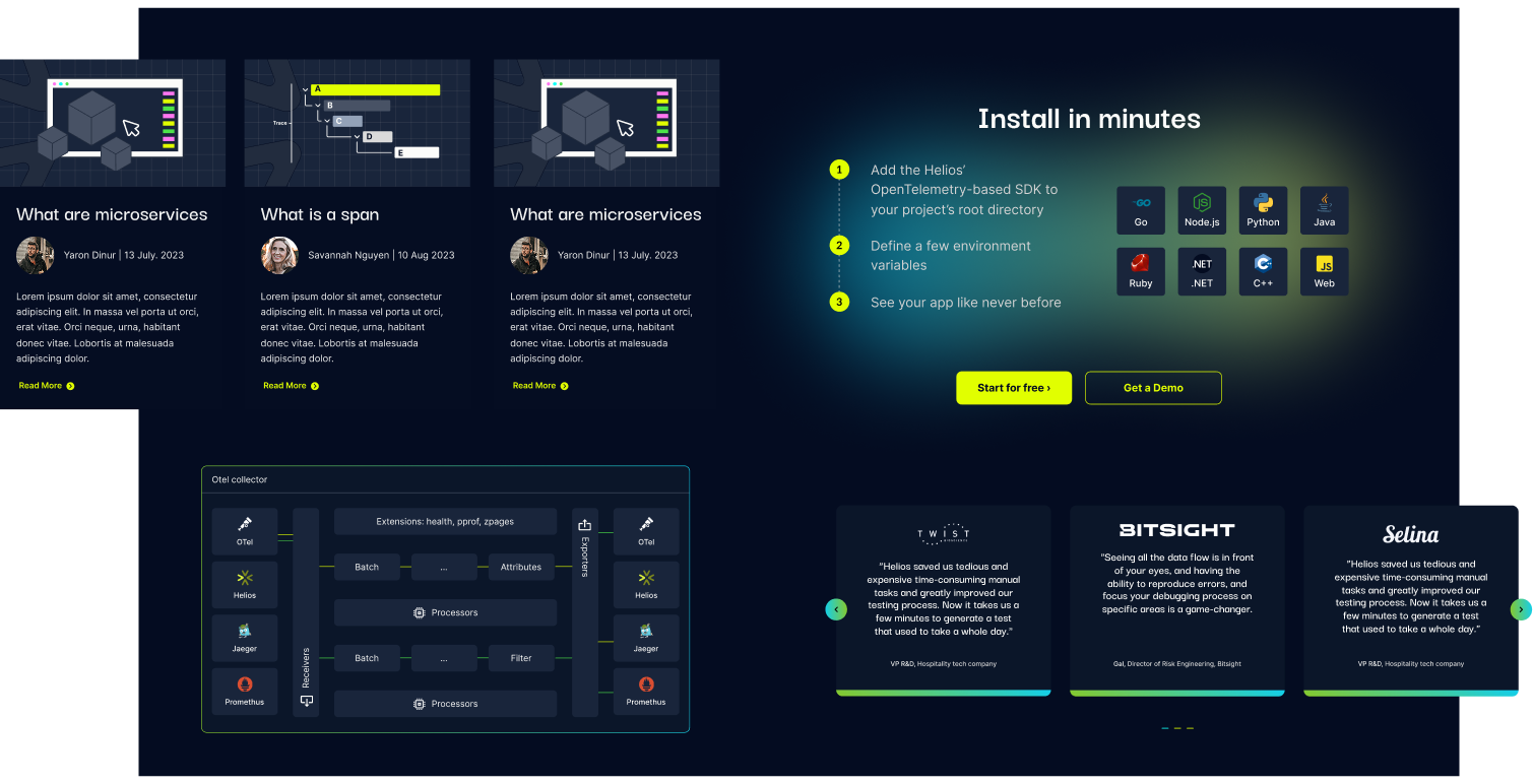
Helios is a runtime application security platform used by cybersecurity teams to monitor services, dependencies, and production environments.
We designed a UX system that helps analysts understand complex relationships between entities, investigate faster, and make decisions with confidence.
The Problem
Analysts struggled to track relationships between services, dependencies, and runtime entities.
┈➤
The Solution
We introduced a graph-based UX with progressive disclosure, allowing users to explore complexity step by step.
┈➤
The Impact
Faster investigation workflows, clearer system understanding, and improved decision-making.
UX Strategy
We structured the Helios platform around five core principles:
1. Visualize Relationships, Not Just Data
2. Progressive Disclosure for Depth
3. Investigation-Oriented Interaction
4. Reduce Cognitive Load in High-Complexity Flows
5. Design for Investigation, Not Just Monitoring
The heart of the platform is the runtime service graph. Instead of presenting vulnerabilities in static tables alone, we designed:
→ A central interactive graph view
→ Clear node hierarchy and directional flows
→ Visual differentiation between services, alerts, and risks
→ Context panels that expand on demand
Security tools often overwhelm users with raw data.
We designed a layered experience:
→ Clean primary workspace (graph / list view)
→ Side inspection panels for detailed metadata
→ Expandable configuration drawers
→ Step-based setup flows for onboarding
Users see what matters first, and can dive deeper only when needed.
Helios is not a reporting dashboard — it’s an analysis tool.
We designed flows that support:
→ Selecting a service and exploring dependencies
→ Tracing attack paths through multiple nodes
→ Viewing HTTP requests and runtime traces
→ Inspecting vulnerability metadata in context
→ Switching between graph and structured list views
Security platforms often surface too much information at once.
For Helios, we focused on reducing cognitive overload by creating a clearer hierarchy between what users need to see immediately and what can stay secondary until needed.
Helios deals with dense, interconnected runtime data. To keep the interface usable under pressure, we designed each screen to guide attention toward the most relevant signals first.
→ Strong visual hierarchy between primary and secondary actions
→ Controlled density across tables, graphs, and side panels
→ Consistent spacing and grouping to improve scanability
→ Interfaces that feel focused, not overwhelming
The platform is not only meant to display system status, it is meant to support active investigation.
That distinction shaped the product experience from the ground up.
Instead of treating each screen as a passive dashboard, we designed Helios as an investigation environment where users can move naturally between signals, context, and actions.
→ Flows built around identifying, tracing, and validating issues
→ Smooth movement between overview and detailed inspection
→ Side panels that support analysis without breaking context
→ A product experience that encourages exploration and decision-making
UX Strategy
We structured the Helios platform around five core principles:
1. Visualize Relationships, Not Just Data
The heart of the platform is the runtime service graph. Instead of presenting vulnerabilities in static tables alone, we designed:
→ A central interactive graph view
→ Clear node hierarchy and directional flows
→ Visual differentiation between services, alerts, and risks
→ Context panels that expand on demand
2. Progressive Disclosure for Depth
Security tools often overwhelm users with raw data.
We designed a layered experience:
→ Clean primary workspace (graph / list view)
→ Side inspection panels for detailed metadata
→ Expandable configuration drawers
→ Step-based setup flows for onboarding
Users see what matters first, and can dive deeper only when needed.
3. Investigation-Oriented Interaction
Helios is not a reporting dashboard — it’s an analysis tool.
We designed flows that support:
→ Selecting a service and exploring dependencies
→ Tracing attack paths through multiple nodes
→ Viewing HTTP requests and runtime traces
→ Inspecting vulnerability metadata in context
→ Switching between graph and structured list views
4. Reduce Cognitive Load in High-Complexity Flows
Security platforms often surface too much information at once.
For Helios, we focused on reducing cognitive overload by creating a clearer hierarchy between what users need to see immediately and what can stay secondary until needed.
Helios deals with dense, interconnected runtime data. To keep the interface usable under pressure, we designed each screen to guide attention toward the most relevant signals first.
→ Strong visual hierarchy between primary and secondary actions
→ Controlled density across tables, graphs, and side panels
→ Consistent spacing and grouping to improve scanability
→ Interfaces that feel focused, not overwhelming
5. Design for Investigation, Not Just Monitoring
The platform is not only meant to display system status, it is meant to support active investigation.
That distinction shaped the product experience from the ground up.
Instead of treating each screen as a passive dashboard, we designed Helios as an investigation environment where users can move naturally between signals, context, and actions.
→ Flows built around identifying, tracing, and validating issues
→ Smooth movement between overview and detailed inspection
→ Side panels that support analysis without breaking context
→ A product experience that encourages exploration and decision-making
Visual Design System
Understanding the Audience
The UX strategy focused on creating an experience that supports both technical depth and fast comprehension.
By combining clear visual hierarchy, contextual exploration, and progressive layers of information, the platform allows users to quickly understand what is happening in the system while still enabling deep investigation when needed.
This approach ensures that the interface remains accessible at first glance, while still providing the level of detail required by advanced security teams.
More Bites from Our Projects...
When Satori approached us, they had already worked with another studio that designed their brand and product entirely in dark mode, following the trend of the time. But Satori had a different vision…

360° Design
A complete digital ecosystem, from the product design, platform UX/UI to marketing materials & presentation templates for global conferences.

360° Design
Automated advertisement video technology platform, designed exclusively for publishers and content owners…