The project aimed to redesign McDonald's order delivery website for the Israeli market, focusing on creating a seamless user experience (UX) and user interface (UI) over six months. In collaboration with Dev team, the project addressed the need for a quick, friendly, and clean flow for ordering meals, with a key emphasis on mobile responsiveness.
Our role at Pixelbites was to shape the end-to-end product experience: from the learning path and lesson flows, through the kids’ UI, to the parents’ dashboard and supporting marketing screens.
Micro Animation
Designing “learn to code” for kids is a balancing act between pedagogy and pure fun. We needed to:
The concept
Make real coding concepts feel approachable for 7–12 year olds.
Clear insights
Give parents clear, trustworthy insight into what their child is actually learning.
Engagement
Keep children engaged over time with a sense of progression and reward.
Designing a world where learning feels like play
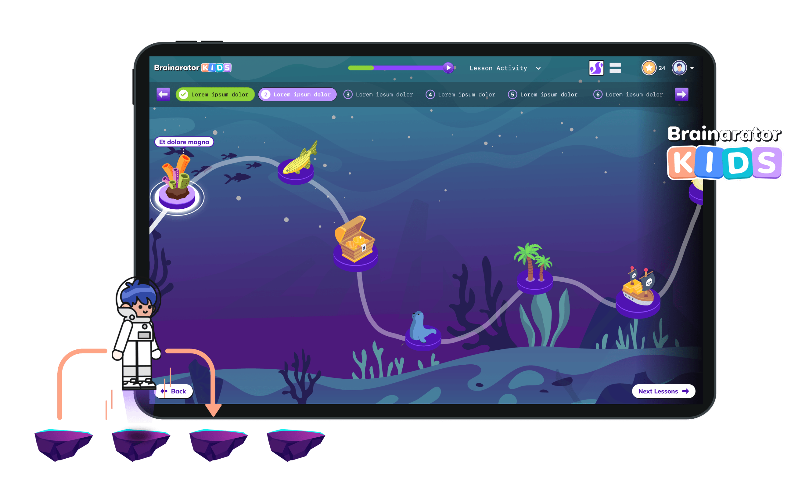
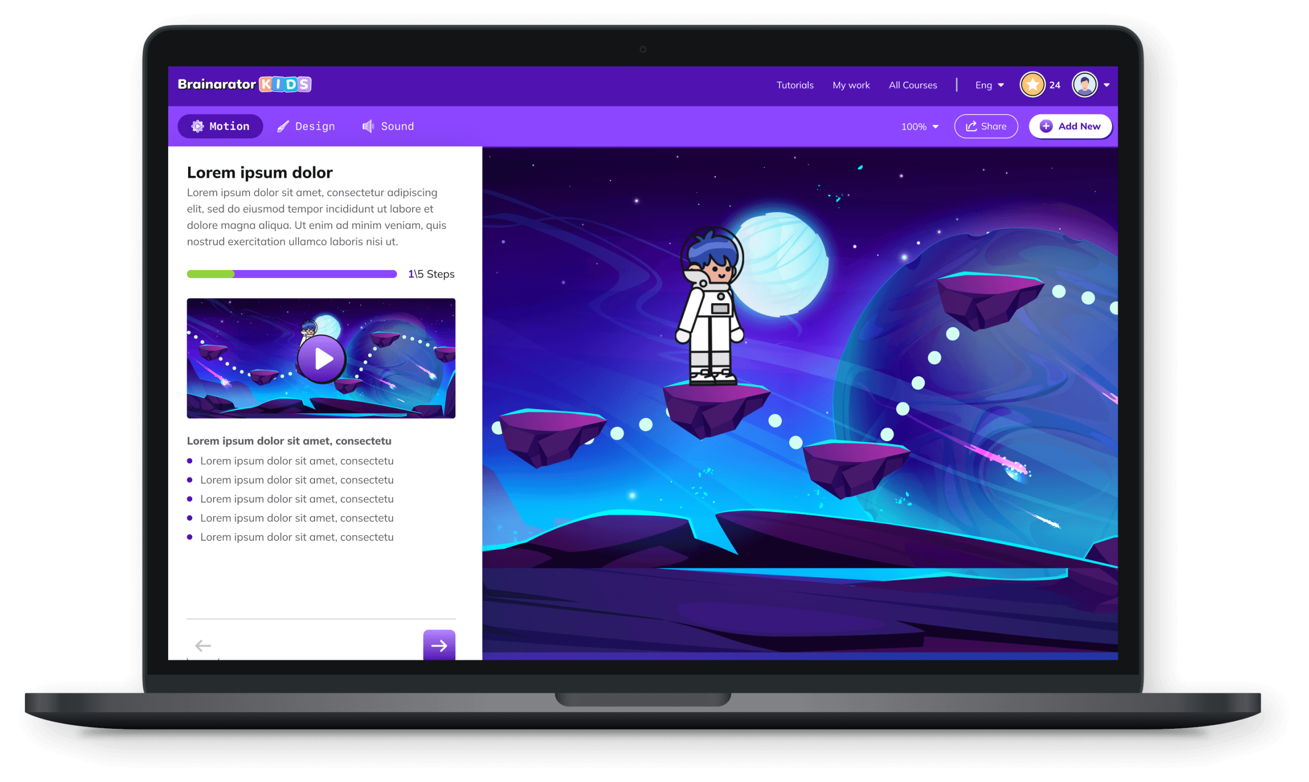
For the kids’ side, we built a visual universe that feels like an adventure game, not a school assignment:
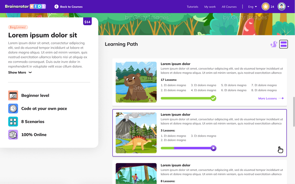
Learning Path & Missions
A cosmic map where lessons appear as planets and stations. Kids “travel” between them, unlocking new areas as they complete tasks.
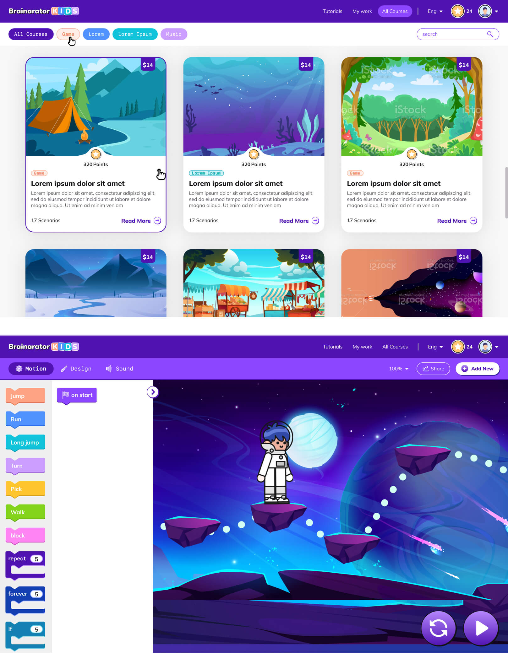
Course & Lessons Screens
A card-based structure for courses and activities, designed so kids can quickly see difficulty, theme and next steps at a glance.
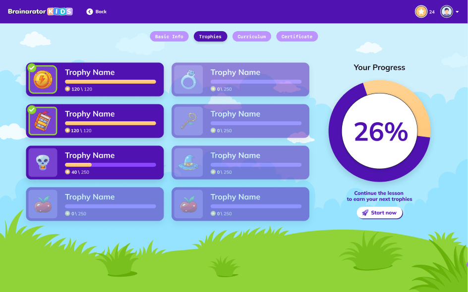
Gamified Feedback
Progress bars, character reactions and subtle celebratory micro-states to reward consistency rather than only “high scores.”
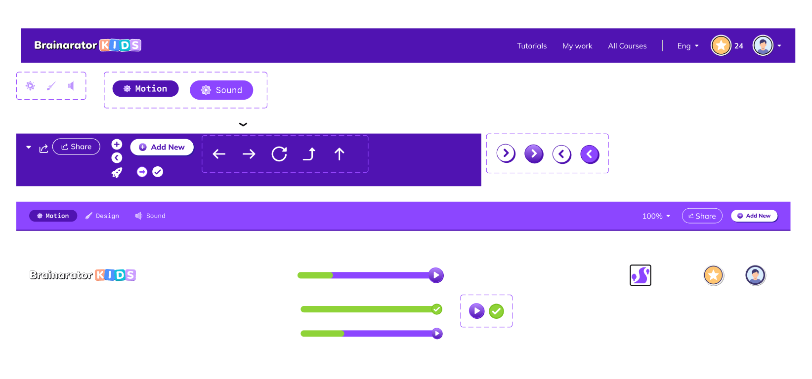
Under the hood, the UI is built from a reusable component library (cards, badges, tiles, progress widgets) so the development team can keep adding missions and worlds without redesigning every screen from scratch.
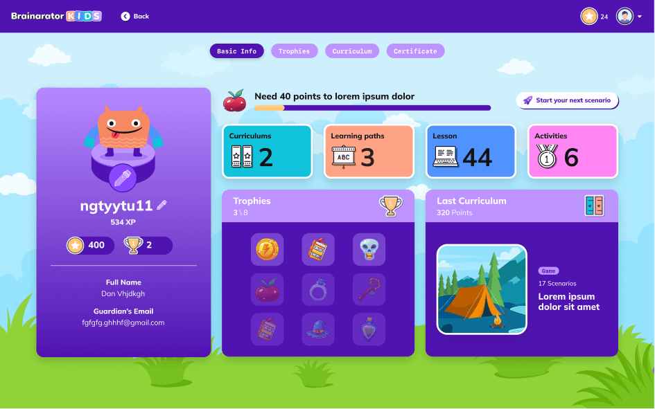
A high-level dashboard
A high-level dashboard showing progress by course, time spent and streaks, so parents can understand the learning journey in seconds.
A high-level dashboard
A high-level dashboard showing progress by course, time spent and streaks, so parents can understand the learning journey in seconds.
Skills and milestones
Drill-down views into skills and milestones, written in clear language instead of technical jargon.
Skills and milestones
Drill-down views into skills and milestones, written in clear language instead of technical jargon.
Friendly but trustworthy
A friendly but trustworthy visual style that feels more like an education app than a game, while still belonging to the same universe as the kids’ interface.
Friendly but trustworthy
A friendly but trustworthy visual style that feels more like an education app than a game, while still belonging to the same universe as the kids’ interface.
Israeli Preferences
Researching Israeli consumer behavior and focusing on returning McDonald's customers' preferences.
Giving parents peace of mind
The parents’ portal translates “screen time” into visible skills gained:
Design systems rule! ✨
Under the hood, the UI is built from a reusable component library (cards, badges, tiles, progress widgets) so the development team can keep adding missions and worlds without redesigning every screen from scratch.
When Satori approached us, they had already worked with another studio that designed their brand and product entirely in dark mode, following the trend of the time. But Satori had a different vision…